Lazy Grid layouts in Compose
May 25, 2022

This post summarizes several ways to build lazy grid layouts as presented in Google I/O 2022 talk on Lazy layouts in Compose. More examples and official API docs are here. This functionality became stable in Jetpack Compose 1.2.0.
Fixed number of cells
Adaptive cell count
Custom grid cells configuration
The source code is at the bottom of this post.
Fixed lazy grid
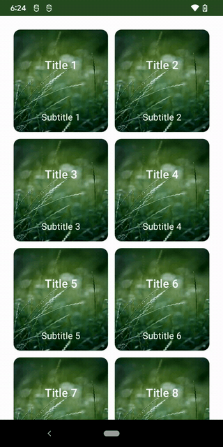
Vertical Grid with fixed number of columns
Column width will be equal to screen width divided by number of columns. If set, Arrangement.spacedBy will be deducted from the total available space prior to calculating.
If the screen is rotated, the same number of columns will be displayed but the cards will be wider.
LazyVerticalGrid(
  columns = GridCells.Fixed(2),
  ...
)
Horizontal Grid with fixed number of rows
Row height will be equal to screen height divided by number of rows.
LazyHorizontalGrid(
  rows = GridCells.Fixed(3),
  ...
)
Adaptive lazy grid
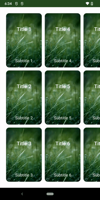
Vertical Grid with adaptive layout
Useful for tablet layouts and different screen sizes in general.
The number of cells in the grid will depend on the available size and spacing between the cells and screen edges. You just specify min size for your cell as param.
Note the difference in portrait vs landscape:
LazyVerticalGrid(
  columns = GridCells.Adaptive(100.dp),
  ...
)
Horizontal Grid with adaptive layout
LazyHorizontalGrid(
  rows = GridCells.Adaptive(128.dp),
)

GridCells interface
GridCells interface defines a single function in its contract, calculateCrossAxisCellSizes and comes with 2 implementations we saw above (Fixed and Adaptive).
interface GridCells {

    fun Density.calculateCrossAxisCellSizes(availableSize: Int, spacing: Int): List<Int>

    class Fixed(private val count: Int) : GridCells {
        override fun Density.calculateCrossAxisCellSizes(
            availableSize: Int,
            spacing: Int
        ): List<Int> {
            return calculateCellsCrossAxisSizeImpl(availableSize, count, spacing)
        }
        ...
    }

    class Adaptive(private val minSize: Dp) : GridCells {
        override fun Density.calculateCrossAxisCellSizes(
            availableSize: Int,
            spacing: Int
        ): List<Int> {
            val count = maxOf((availableSize + spacing) / (minSize.roundToPx() + spacing), 1)
            return calculateCellsCrossAxisSizeImpl(availableSize, count, spacing)
        }
        ...
    }
}
Custom lazy grid configuration
You can create a custom implementation of GridCells by overriding calculateCrossAxisCellSizes.
Example below defines a vertical grid with 2 columns where the first column is twice wider than second column.
LazyVerticalGrid(
  columns = object : GridCells {
    override fun Density.calculateCrossAxisCellSizes(
      availableSize: Int,
      spacing: Int
    ): List<Int> {
      val firstColumn = (availableSize - spacing) * 2 / 3
      val secondColumn = availableSize - spacing - firstColumn
      return listOf(firstColumn, secondColumn)
    }
  },
  ...
)
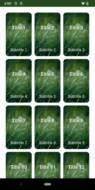
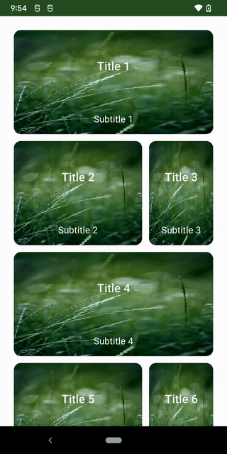
Now let’s make the first card is a header that should take up entire available width:
LazyVerticalGrid(
  columns = object : GridCells {
    override fun Density.calculateCrossAxisCellSizes(
      availableSize: Int,
      spacing: Int
    ): List<Int> {
      val firstColumn = (availableSize - spacing) * 2 / 3
      val secondColumn = availableSize - spacing - firstColumn
      return listOf(firstColumn, secondColumn)
    }
  },
  horizontalArrangement = Arrangement.spacedBy(12.dp),
  verticalArrangement = Arrangement.spacedBy(12.dp),
  contentPadding = PaddingValues(24.dp)
) {
  cardData.forEachIndexed { index, card ->
    if (index == 0) {
      item(span = { GridItemSpan(maxLineSpan) }) {
        MyCard(
          title = card.first,
          subtitle = card.second
        )
      }
    } else {
      item(span = { GridItemSpan(1) }) {
        MyCard(
          title = card.first,
          subtitle = card.second
        )
      }
    }
  }
}
Which renders the following:
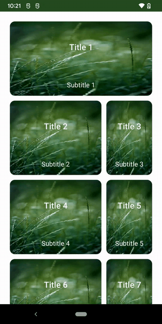
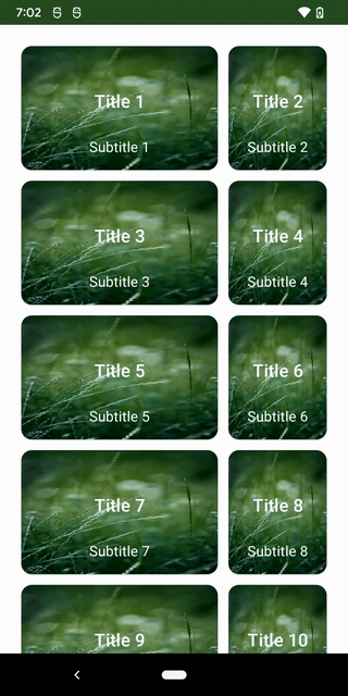
And now let’s make every third item (starting with the first one) take up entire available width. We can loop through items and specify different LazyGridScope.item(span = {value}) depending on item index.
LazyVerticalGrid(
  columns = object : GridCells {
    override fun Density.calculateCrossAxisCellSizes(
      availableSize: Int,
      spacing: Int
    ): List<Int> {
      val firstColumn = (availableSize - spacing) * 2 / 3
      val secondColumn = availableSize - spacing - firstColumn
      return listOf(firstColumn, secondColumn)
    }
  },
  horizontalArrangement = Arrangement.spacedBy(12.dp),
  verticalArrangement = Arrangement.spacedBy(12.dp),
  contentPadding = PaddingValues(24.dp)
) {
  cardData.forEachIndexed { index, item ->
    if (index % 3 == 0) {
      item(span = { GridItemSpan(maxLineSpan) }) {
        MyCard(
          title = item.first,
          subtitle = item.second
        )
      }
    } else {
      item(span = { GridItemSpan(1) }) {
        MyCard(
          title = item.first,
          subtitle = item.second
        )
      }
    }
  }
}
Which shows the following:
Finally, here is a full source code for your reference:
class MainActivity : ComponentActivity() {
  override fun onCreate(savedInstanceState: Bundle?) {
    super.onCreate(savedInstanceState)
    setContent {
      LazyLayoutsDemoTheme {
        // A surface container using the 'background' color from the theme
        Surface(
          modifier = Modifier
            .fillMaxSize(),
          color = MaterialTheme.colors.background
        ) {
          Box(
            modifier = Modifier
              .fillMaxWidth()
              .wrapContentSize(Alignment.Center)
          ) {
            MyCardList()
          }
        }
      }
    }
  }
}

@Composable
fun MyCardList() {
  val cardData = remember { generateFakeCards() }

  LazyVerticalGrid(
    columns = object : GridCells {
      override fun Density.calculateCrossAxisCellSizes(
        availableSize: Int,
        spacing: Int
      ): List<Int> {
        val firstColumn = (availableSize - spacing) * 2 / 3
        val secondColumn = availableSize - spacing - firstColumn
        return listOf(firstColumn, secondColumn)
      }
    },
    horizontalArrangement = Arrangement.spacedBy(12.dp),
    verticalArrangement = Arrangement.spacedBy(12.dp),
    contentPadding = PaddingValues(24.dp)
  ) {
    cardData.forEachIndexed { index, card ->
      if (index == 0) {
        item(span = { GridItemSpan(maxLineSpan) }) {
          MyCard(
            title = card.first,
            subtitle = card.second
          )
        }
      } else {
        item(span = { GridItemSpan(1) }) {
          MyCard(
            title = card.first,
            subtitle = card.second
          )
        }
      }
    }
  }
}

@Composable
fun MyCard(
  title: String,
  subtitle: String
) {
  Card(
    shape = RoundedCornerShape(12.dp),
    modifier = Modifier
      .height(180.dp)
      .width(140.dp)
  ) {
    Image(
      painter = painterResource(id = R.drawable.green_card),
      contentDescription = null,
      contentScale = ContentScale.FillBounds
    )
    Column(
      verticalArrangement = Arrangement.SpaceBetween,
      horizontalAlignment = Alignment.CenterHorizontally,
      modifier = Modifier
        .padding(
          top = 48.dp,
          bottom = 16.dp
        )
    ) {
      Text(
        text = title,
        color = Color.White,
        style = MaterialTheme.typography.h6,
        textAlign = TextAlign.Center
      )
      Text(
        text = subtitle,
        color = Color.White,
        style = MaterialTheme.typography.subtitle1,
        textAlign = TextAlign.Center
      )
    }
  }
}

@Preview(showBackground = true)
@Composable
fun MyCardPreview() {
  LazyLayoutsDemoTheme {
    MyCard(
      title = "my title",
      subtitle = "my subtitle"
    )
  }
}

private fun generateFakeCards(): List<Pair<String, String>> {
  return MutableList(20) { index ->
    val cardNumber = index + 1
    "Title $cardNumber" to "Subtitle $cardNumber"
  }
}
Notice that inside LazyVerticalGrid content lambda, you have access to LazyGridScope which gives you access to item, items and itemsIndexed and their overloads.